Smart Groceries
Plan smarter. Shop intentionally.
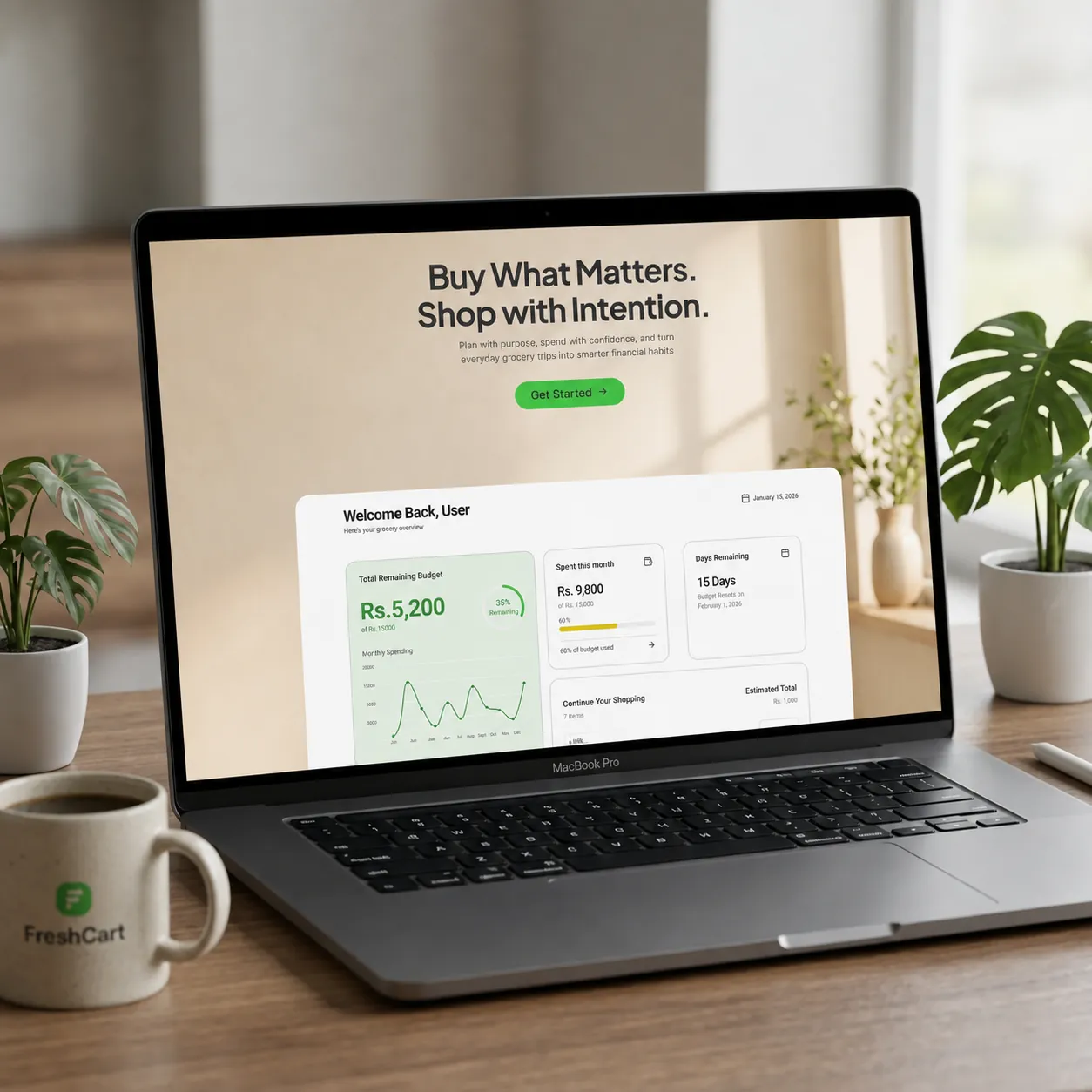
A grocery planning and budgeting experience designed to help people organize their shopping, understand their spending, and make more intentional purchasing decisions.
Overview
Making grocery spending easier to understand
Grocery shopping involves more than simply deciding what to buy. People need to plan their purchases, estimate costs, stay within a budget, and understand where their money goes over time. When these activities happen separately, it becomes difficult to maintain a clear picture of spending.
SmartGroceries brings budgeting, grocery planning, shopping, and purchase history into one experience.
The project was created as a self directed UI/UX practice project to explore an end to end product design process from problem definition and user understanding to information architecture, interface design, and design systems.
“People don't necessarily need to plan more. They need to see their spending more clearly.”
The Problem
Grocery shopping is more than making a list.
A shopping list can tell you what to buy, but it doesn't necessarily help you understand:
How much you can afford to spend
How much you've already spent
Whether you're staying within your budget
What you purchased previously
Where your grocery money goes over time
This can make everyday shopping harder to manage, especially for people working with a limited budget or those who simply want better visibility into their spending.
The Design Challenge
How might we make grocery planning and spending easier to understand and manage in one place?
Understanding the user
Looking beyond the shopping list
To explore the problem space, I created three hypothetical user personas representing different grocery-shopping behaviors and constraints.
User - 01
The Impulse Shopper
25 · Middle income · Weekly shopping
Impulse purchases make it difficult to stay within budget
Attracted by discounts or new packaging, they often purchase non-essential groceries, finding it hard to monitor items added mid-trip.
User - 02
The Budget Guardian
22 · Low-middle income · Weekly shopping
Food prices fluctuate and make budgeting difficult
Calculates every item to stay exactly on target. Price hikes create constant anxiety without instant remaining allowance updates.
User - 03
The Efficiency Seeker
35 · Higher income · Biweekly shopping
Wants a quick spending overview without repetitive planning
Seeks to review past purchases easily to replicate lists, saving time on planning and shopping trips while ensuring budget visibility.
Key
Insight
Although the personas have different motivations, they share a common problem:
They don't necessarily need to plan more. They need to see their spending more clearly.
This shifted the design direction from simply building a better grocery list toward creating visibility around budgeting and purchase history.
Product Thinking
From planning to purchase to reflection
Based on the problem space, I focused the core experience around a simple loop that connects budgeting, preparation, shopping, and analysis seamlessly.
Core Loop Process
01
Set Budget
Define limit
02
Create List
Plan items & costs
03
Shop
Track cart live
04
Complete
Purchase total
05
Review
Evaluate trends
MVP focus
- Set monthly grocery budget
- See remaining budget
- Track spending
- Create grocery lists
- Add items and quantities
- Estimate shopping costs
- Use the list while shopping
- Mark shopping session completed
- View previous purchases
- Understand previous spending
- Revisit previous lists
Future Possibilities
Features such as receipt scanning, spending charts, price trends, and smart recommendations were intentionally kept outside the core experience.
User Flow
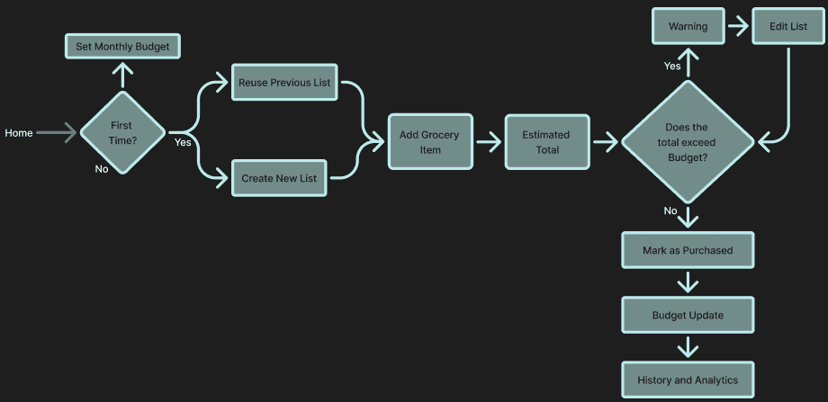
A simple path through the product
The primary user journey moves from initial setup into active shopping and finally into reflection. Profile and account management are treated as global destinations rather than steps in the shopping journey.
Wireframes
Starting with structure
Before developing the visual language, I mapped the core screens and information hierarchy through wireframes. At this stage, the focus was structure and task flow rather than visual polish.
Final UI
From onboarding to the daily dashboard experience — the finished interface across desktop and mobile.
Reflection & Next Steps
This project pushed me to think about the product as a connected system rather than a set of screens — visibility over more planning became the lens for every decision that followed.
Lessons Learned
A problem statement quietly shapes every feature decision that follows it.
It's easy to default to a feature-heavy solution — narrowing to visibility kept the MVP honest.
Designing the system behind the screen matters as much as the screen itself.
What I'd Test Next
SmartGroceries explores how thoughtful information architecture, visual hierarchy, and a consistent design system can turn an everyday task into a clearer digital experience.